Monday, February 6, 2017

Where Active Fund Investors Were Flocking to & Fleeing From in 2016

We all have heard about the ongoing industry shift from Active to Passive Funds as illustrated below via Morningstar
However, despite Active funds as a whole being in net redemptions...there are still net winners and losers. Below I have highlighted the Active Mutual Funds within the largest 15 Morningstar categories with the most net inflow and most net outflows in 2016.

While this does tell you investor preference for 2016.....it also might just highlight investor short-termism. While some may have been due to legit concerns about a recent manager departure (Virtus Emerging Markets Opp and Pimco Total Return come to mind). A lot could have simply had to do with bad performance the year before in 2015. In fact, of those listed with the most outflows....11 of the 15 lost to their benchmark in 2015.

However, it seems investors may be overly focused on shorter term returns, because heading into 2016 12 of those 15 funds with the most outflows had records of 10yrs or more.....and 9 of those 12 beat their benchmarks over that timeframe. While each situation is unique, history says investors shouldn't be given the benefit of the doubt....they historically make bad timing decisions when it comes to hiring or firing managers.

Monday, December 12, 2016

Why Do Unified Republican Governments Always Lead to Crisis?


While I believe the purpose of these types of headlines and tweets are to illicit positive emotions, readers would be well advised to look up the DISASTROUS history of extended periods of unified Republican governments. 

In fact, the ONLY 3 PERIODS of extended unified Republican governments going back to 1900 ALL DIRECTLY led to banking crises....Arguably the 3 worst in US History. To be clear, I am defining 'extended' unified governments as anytime they control the House, Senate and White house for at least 4 years. This does not include short 2 year stints since it's hard to screw things up that quick (FYI there was only 1 period of that anyway, 1953-1955). You can look up the periods yourself here and more detail here.

The list of Unified Republican Government crises include the Panic of 1907The Great Depression, and the Financial Crisis of 2007-2008. Interestingly, the record of extended Republican control of Congress has also only led to crises. There have only been 4 periods of extended Republican control of Congress (3 of which overlap with the periods of full unified control just mentioned). However, the 4th period (I KID YOU NOT) ended in the 2000 DotCom Bust where the Republicans controlled the House and Senate from 1995-2001.

In short, full Republican control has NO history of making America great...let alone AGAIN. Don't feel like checking out that history yourself? Here's what you'll find....
Technically Republicans took control in 1895 but this graph does not start there. And While I mentioned the Panic of 1907......I will just brush off the Panic of 1901. Markets fell over 43% before bottoming after both events. How they were not thrown out until 1911 is anyone's guess.

Then we have the Great Depression fuelled by the unsustainable laissez-faire polices of the roaring 20's.
Only led to the greatest market decline in history and total social devastation.....Is that the type of "Great" we want to make again? 

Oh and then we have the Financial Crisis of 2007-2008
This case meets the minimum for "extended" by getting to 4 years (although technically they almost had 6 full years as only 1 independent tipped the senate democrat in 2001). Again lax regulations created the housing bubble which popped in 2006 and lead to our famous bank failures and financial crisis. (Case Shiller housing price index)

While the Republicans managed to get kicked out of Congress in 2007 the coming disaster was already well in motion by then.

While that wraps up the History of the 3 worst banking crises in American History...or um....I mean the History of the "Unified Republican Government". It would not be complete without completing it with the final piece to the history of the extended Republican control of Congress....which is only complete with the DotCom Bust of 2000.
There we have it folks! The disastrous history which has accompanied EVERY extended Unified Republican Government (or control of congress) since 1900. Think I'm missing a period that didn't end in disaster? Check for yourself. I'm not.

Saturday, January 30, 2016

Analyst Price Targets Gone Wrong

So I was recently browsing a report by FactSet which aggregates analyst price target data for stocks. So for fun, I went back to last year's report to see what was said and how things turned out.....Results? Ugly.

First, I looked at their interesting chart which shows the top 10 stocks in the S&P 500 whose price at the start of 2015 was most significantly below its aggregate analyst price target.

The average of these 10 stocks were 45.7% below their price targets. Wow, sounds awesome, why not just make a portfolio of these 10 stocks and roll with it...+47.5% returns here we come! Well, here is how that would have turned out.

No, I did not reverse the signs....they actually were THAT bad! They had the average % return correct.....JUST IN THE WRONG DIRECTION!! Remember folks....the S&P 500 returned +1.4% in 2015, if you equal weighted all 500 stocks it still would have been only -2.2%. It's quite a feat to do this badly.

How about the stocks whose aggregate price targets were most BELOW their starting price in 2015? The stocks they thought would do worst?

Here, on average, they expected these stocks to decline -12.1%. And the results?
Well atleast the average fall was close but what I hope your noticing is how much BETTER these did then those expected to perform best. Not only that but this group actually included 4 stocks that were positive and 6 stocks that performed better than the equal weighted S&P 500.

Lastly, how about just a bottom up look at expected sector returns? What were they saying in 2015?
Ok, so they were expecting 6.8% for the S&P and it returned 1.4% but what about if you want to use this to overweight some sectors? How about if you just equal weight the top 5 sectors (Energy, Materials, Industrials, Telecom & Health Care)? That would give you an expected return of 10.0%. Results?

Terrible, enough said.


Saturday, October 17, 2015

Conflicts of Interest: A Look at Advisors vs Clients Paying Ticket Charges

More and more Financial Advisors have moved from a commission based compensation arrangement to a Fee-Based arrangement based on a percentage of Assets Under Management (AUM). For example, in a very common setup the advisor will charge 1% per year on the assets of their client. This trend will only continue to grow as the Department of Labor finalizes their "fiduciary rule" and commission based products get pushed to the wayside.

AUM based pricing theoretically puts both the client and the advisor on the same side of the table. If the clients account goes down 10% then so will the advisors compensation. However, what is often overlooked in the discussion is that there is more then one way in which fee-based AUM pricing is done and what is included.

For example, Some advisors may charge 1% of AUM and the client will be responsible for the ticket charges incurred for buying or selling funds. Meanwhile, other advisors may absorb the ticket charges and pay for them out of the fee they are charging the client. On the face of things, as a client, you may like the simplicity of the ticket charges being included in the fee. However, what you may not have noticed is the massive conflict-of-interest which that arrangement has introduced into the relationship when it comes to making changes in the portfolio.

To illustrate, let's assume that each buy or sell of a mutual fund or ETF costs $10 (in reality some funds avoid transaction fees and some cost much more $25+ depending on where they are executed). Now, let's assume the advisor is contemplating replacing Fund A with Fund B. In a normal environment where the client is going to pay the transaction cost, this would be a sort of cost-benefit look at the transaction

Cost to Sell Fund A = $10
Cost to Buy Fund B = $10

Total Transaction Costs = $20

Amount currently in Fund A = $40,000

Amount Fund A would need to outperform Fund B to make up for transaction costs?
$20/$40,000 = 0.05%


However, what about a situation where the Advisor is going to pay for the transaction costs? Remember, the advisor gets paid a percentage of assets under management. To properly understand the situation you must also understand what it takes the advisor to MAKE that $20. For an advisor to make back that $20, they must get $2,000 more under management (1% of $2,000 = $20). Therefore, the cost benefit analysis from the advisors perspective can start to conflict with the clients. The client only needed Fund A to outperform Fund B by $20 (or 0.05%) for the transaction to pay for itself since the client essentially gets all the profit (less 1%). For the Advisor, he needs to manage $2,000 more to fund that $20 transaction.  Therefore his cost benefit is different.....

Cost to Sell Fund A = $10
Cost to Buy Fund B = $10

Total Transaction Costs = $20

Amount of additional AUM advisor needs to pay transaction cost = $2,000 (1% of $2,000 = $20)

Amount currently in Fund A = $40,000

Amount Fund A would need to outperform Fund B to make up for transaction costs?
$2,000/$40,000 = 5.0%


Yes, from a cost-benefit perspective of the advisor Fund A needs to outperform by 5%! Just imagine if the dollar amount in the Fund was less? If the position size was $20,000 instead of $40,000, then Fund A would need to outperform by 10% from the advisors perspective! Meanwhile, it would only need to outperform by 0.1% from the clients perspective in a normal situation which they pay the transaction cost.

Clearly the conflict of interest that is introduced is the fact that the Advisor has MUCH less incentive to make moves in the account if they are paying the transaction costs. This is because there is a MUCH higher hurdle to get over before the transaction benefits them.

To grasp this fact a little more let's look at this from a hypothetical firm perspective. If the Firm has 500 clients in Fund A, this is what a switch to Fund B would cost them....

Cost to Sell Fund A = $10 x 500 clients = $5,000
Cost to Buy Fund B = 
$10 x 500 clients = $5,000
Total Transaction Costs = $10,000

Additional AUM Firm needs to pay transaction costs = $1,000,000 (1% of $1,000,000 = $10,000)

Yes, for switching from Fund A to Fund B the firm must either have Fund A outperform Fund B by 5% (assuming average position size of $40,000) OR the firm must bring on a new account worth $1,000,000.

Now this is just 1 fund switch, this also applies on a larger scale to something like a complete rebalancing. Now Advisors may say that because they are absorbing the transaction costs they raised their fee slightly to compensate for this....however, if you think that solves the conflict of interest problem you are kidding yourself. The reality is they are charging that rate INDEPENDENT of the number of trades they ultimately make. Reducing those even slightly makes a quick addition to the bottom line.

This conflict of interest only gets nastier if the market were to tank. Lets say a firms portfolios are down 20%+, therefore their revenue is down 20%+. Do you honestly think that firm is not going to be tempted to make less trades then they otherwise would?

To stay on the same side of the table, I think firms should pass on ticket charges. Then they are more likely to look at the same cost-benefit analysis as the client when they consider transactions.

Tuesday, August 25, 2015

Unconstrained Bond Funds Stress Tested (Sorry Bill)

Considering the Unconstrained Bond Fund area or the "Non-Traditional" Bond fund area is a pretty recent development, many of the funds did not exist in 2008. I thought it would be interesting to see who made it through the recent 3 trading day manic selloff the best and the worst (8/20-8/24). This screen includes all funds in the Non-Traditional Bond Morningstar category.

First lets take a look at the worst. You may spot somebody from old Pimco fame....

THE WORST
Bill's fund is the only one on that list with decent assets, as the next biggest fund (Parametric Absolute Return) is barely 30mil. Might want to tone that risk down Bill. And for the best?

THE BEST

As for comparison, the Barclays Agg was up 0.41%, which would have given it the 5th spot. The Non-Traditional Bond category average was -0.78%.

Sunday, April 19, 2015

Financial Blogger Personalities Analyzed By IBM's Watson

IBM has an interesting personality insights service. According to IBM "The Watson Personality Insights service uses linguistic analytics to extract a spectrum of cognitive and social characteristics from the text data that a person generates through blogs, tweets, forum posts, and more."

I thought it would be interesting to run this test on some well known financial bloggers......


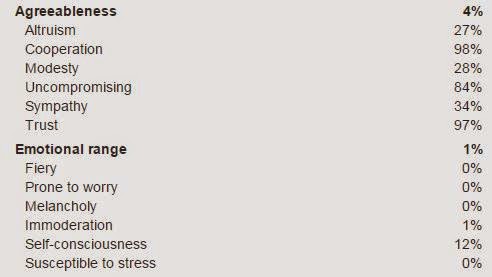
I fed Josh's recent post "The Biggest Threat To You Portfolio" into the service and this is what IBM's Watson had to say.
"You are inner-directed and skeptical.
You are empathetic: you feel what others feel and are compassionate towards them. You are calm-seeking: you prefer activities that are quiet, calm, and safe. And you are independent: you have a strong desire to have time to yourself.
Your choices are driven by a desire for belongingness.
You are relatively unconcerned with tradition: you care more about making your own path than following what others have done. You consider helping others to guide a large part of what you do: you think it is important to take care of the people around you."


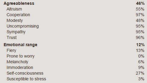
For Barry I fed in his recent post (Protect Your Assets: Common-sense CyberSecurity for Investors) and Watson says....
"You are shrewd and somewhat insensitive.
You are proud: you hold yourself in high regard, satisfied with who you are. You are confident: you are hard to embarrass and are self-confident most of the time. And you are assertive: you tend to speak up and take charge of situations, and you are comfortable leading groups.
Your choices are driven by a desire for prestige.
You are relatively unconcerned with tradition: you care more about making your own path than following what others have done. You consider helping others to guide a large part of what you do: you think it is important to take care of the people around you."


Here I plugged in Bill's text from this post. This is Watson's feedback.....
"You are inner-directed, heartfelt and rational.
You are imaginative: you have a wild imagination. You are philosophical: you are open to and intrigued by new ideas and love to explore them. And you are deliberate: you carefully think through decisions before making them.
Your choices are driven by a desire for organization.
You are relatively unconcerned with helping others: you think people can handle their own business without interference. You consider tradition to guide a large part of what you do: you highly respect the groups you belong to and follow their guidance."

Side Note: Wow did that really just say 0% for extraversion? Can't get more introverted then that. While I have not met Bill, considering his blog, why do I not find that surprising?


I used his most recent most  and it appears Watson confirms his Philosophical nature....
"You are inner-directed, skeptical and can be perceived as insensitive.
You are philosophical: you are open to and intrigued by new ideas and love to explore them. You are independent: you have a strong desire to have time to yourself. And you are unconcerned with art: you are less concerned with artistic or creative activities than most people who participated in our surveys.
Your choices are driven by a desire for discovery.
You are relatively unconcerned with both taking pleasure in life and helping others. You prefer activities with a purpose greater than just personal enjoyment. And you think people can handle their own business without interference."

So what does Watson say about me? I used my last post to find out....
"You are inner-directed, heartfelt and rational.
You are self-assured: you tend to feel calm and self-assured. You are calm-seeking: you prefer activities that are quiet, calm, and safe. And you are dispassionate: you do not frequently think about or openly express your emotions.
Your choices are driven by a desire for discovery.
You are relatively unconcerned with helping others: you think people can handle their own business without interference. You consider achieving success to guide a large part of what you do: you seek out opportunities to improve yourself and demonstrate that you are a capable person."

Interesting to see all the bloggers I put in (except for Barry) were said to be "Inner-Directed" first and foremost. Check out yourself or someone else here https://watson-pi-demo.mybluemix.net/

Friday, January 16, 2015

Doubleline Data Fail, The Stock Market Has been up for 7 straight years...and More!

Recently Jeffrey Gundlach from Doubleline had a conference call and soon the below chart was being passed around Twitter (even I passed it around, before stopping to think about it for a second).


However, as people may recall, we had quite strong markets in both the 80s and 90s. Yet this chart shows that the streaks never got longer than 5 years in those decades. However, a quick check of the history books will remind everyone that the market was up 8 straight years from 1982-1989 and then was also up 9 straight years from 1991-1999. Below are the 2 separate streaks. You will also notice that there was only 1 down year of -3.06% in 1990 that actually stopped it from being 18 straight years.


So how did Doubleline mess this up? Well according to their chart their source data appears to be well known shiller data http://www.econ.yale.edu/~shiller/. The excel file is here. Odd they would use this for annual returns however, because that is not the purpose of the data...and you can't get calandar year returns from the data! (or any 1 year period for that matter) You will notice they say the streak in the 1980s was only 5 years. This is because they say the 1982 run ended in 1987....only 1987 was positive 5.81%. Why did they mess up? Well Shiller doesn't quote annual S&P returns. He only gives monthly S&P levels and they are NOT the starting or ending level for the month. They are the AVERAGE S&P level for the month. So the fact of the matter is you can't get calendar year returns from this data . Here is what it looks like 
The market closed at 242.12 on 12/31/86 and closed at 247.08 on 12/31/87. That's 2% up plus the dividends got you to 5.81% for 1987. None of those numbers match the Shiller data because his data is the AVERAGE close for everyday of the month.

So now everyone can stop repeating this inaccurate information. Thanks! (yes I did it too!)
-------------------------------------------------------------------------------------------------------

Additional Note: I have since come across an article where Roland Kaloyan of Societe Generale states in December "Since 1875, we have never seen the S&P rise for seven calendar years in a row, so an eighth year would seem highly unlikely,". Who was the originator of this myth?

Sunday, August 17, 2014

How The Largest Actively Managed Mutual Funds From 15 years Ago Performed

You can't go long without reading an article about the death of active management. Somewhere in a discussion like that you will also hear that the larger a fund gets the more likely it is to under-perform. My purpose of this post is not to get into either of those issues but I thought it would be interesting to take a glimpse back in time to the largest funds of 1999 (15 years ago).

For this exercise I decided to screen for the largest actively managed funds 15 years ago (8/1999) which had the S&P 500 as their prospectus benchmark. The top 10 results looked like this


So how did they do? Were they too big to outperform?

Indeed, the largest fund did manage to under-perform. However, as a whole, these large funds did quite well. Over the last 15 years the largest 10 funds which were benchmarked to the S&P 500 managed to return an average of 5.47% compared to 4.47% for the S&P 500.

What's also interesting is that despite the fact that I compared them all to their prospectus benchmark of the S&P 500, a few of them tend to have a known growth tilt (Vanguard Primecap, Growth Fund of America, Fidelty Contrafund) but they all managed to significantly beat the S&P 500 despite the fact that growth significantly underperformed the S&P during this time (Russell 1000 Growth returned only 3.18% compared to 4.47% on the S&P 500).

Monday, July 14, 2014

Test Makers Fail Financial Literacy Test

So news was recently going around about a Financial Literacy Test made by the OECD. The Wall Street Journal provided 5 sample questions from the test and I must say that the OECD fails it's own question.

First of all I'm switching the "zeds" to $ for typing purposes. So Mrs Jones current loan balance is $7400, it has a 15% interest rate with monthly payments of $150. This means that the loan will take 78 payments (months) to payoff and TOTAL INTEREST paid over the life of the loan will be $4,178 (yes below it equals $4,180 due to rounding).


However, if she decides to take out a new larger loan of $10,000 at an interest rate of 13% while repaying at the same $150 rate then it will take 119 payments (months) to payoff and TOTAL INTEREST paid over the life of the loan will be $7,832. In other words she will be paying $3,654 MORE INTEREST.

Despite these facts OECD says the answer is as follows
Clearly A, as I showed earlier, is not correct. Therefore C is also wrong. While she is paying a lower interest RATE, she is clearly paying HIGHER INTEREST in total ($7,832 vs $4,178). B is in fact correct, she will have more money available but she will be paying interest on that money and unless she has an investment that is going to earn her more then the cost of funds (13%) she would be better off taking a smaller loan.

Why am I not surprised that the OECD would come up with this clearly incorrect answer regarding interest paid? Because they seem to encourage over-leveraged economies at every opportunity, so here they are teaching incorrect information, helping everyone become slaves to debt through bad information.

Thursday, May 15, 2014

Many Government Bonds Yielding Less Than United States

I can't listen to a talking head, bond manager, strategist or seemingly anyone without hearing about how "Rates can only go higher from here". When in reality THEY CAN go lower! In fact, when you look around the world, on a relative basis, THEY SHOULD!

Look at that list and tell me the United States should pay more on their debt then all those countries. France is borrowing at 1.77% people, FRANCE! You have Japan borrowing at a rate 76% lower than the US with more than twice the debt. Now all this doesn't mean the united states SHOULD trade lower, but it's either that or others SHOULD trade higher because on a relative basis, much is out-of-whack. And those calling for much higher rates in the U.S should realize that basket cases like Italy and Spain are trading at 3.1%!

Interestingly enough, despite the relative attractiveness of US rates you have nearly EVERY "unconstrained" bond fund avoiding US duration risk at all costs, meanwhile loading up on risky credit. How often is the herd correct?